A professional office should begin making the right impression before anyone steps through the door.
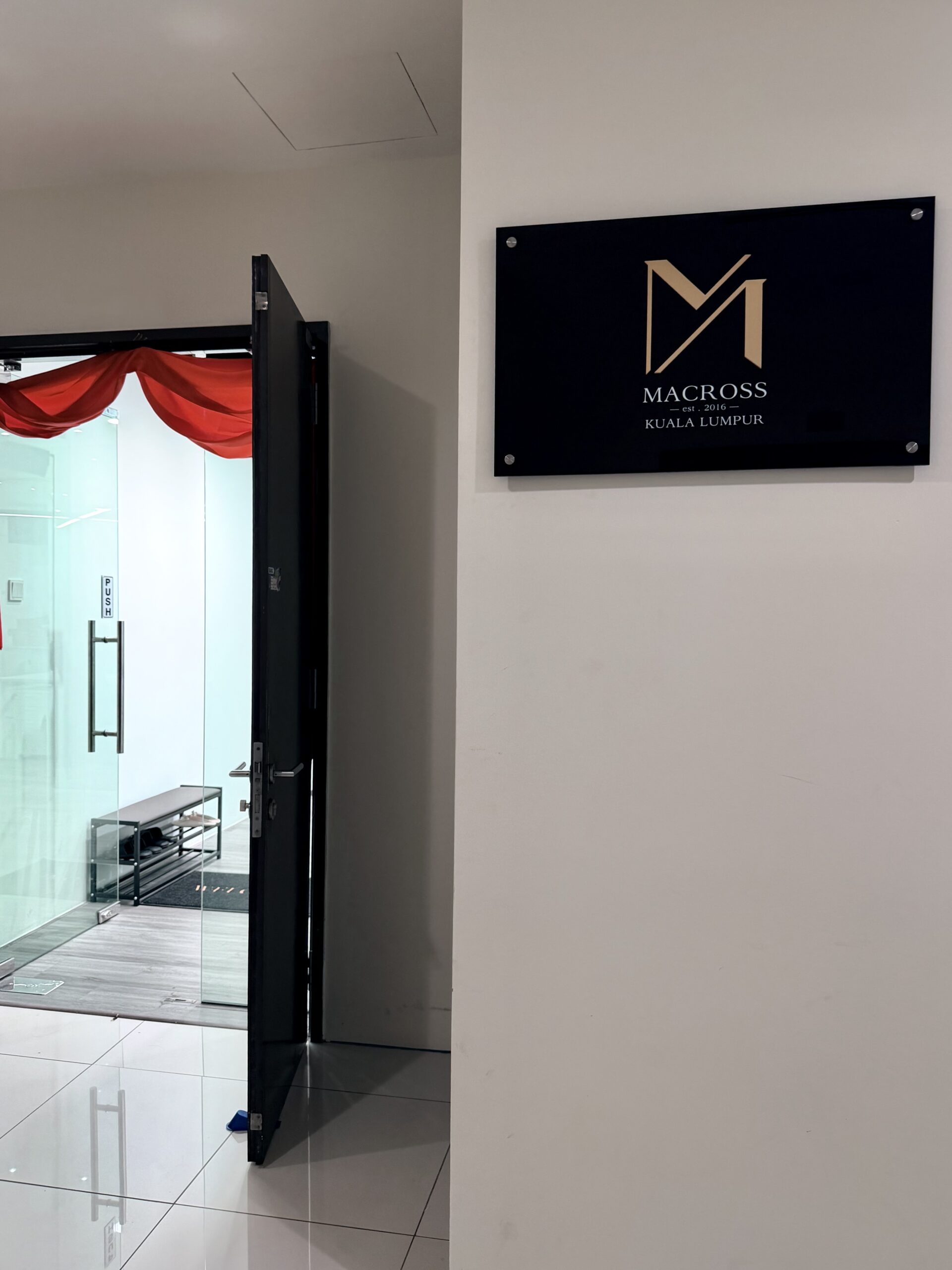
For this corporate office signage, the approach was intentionally simple. No elaborate lighting. No oversized visual statements. Just a clean and considered presentation of the brand.
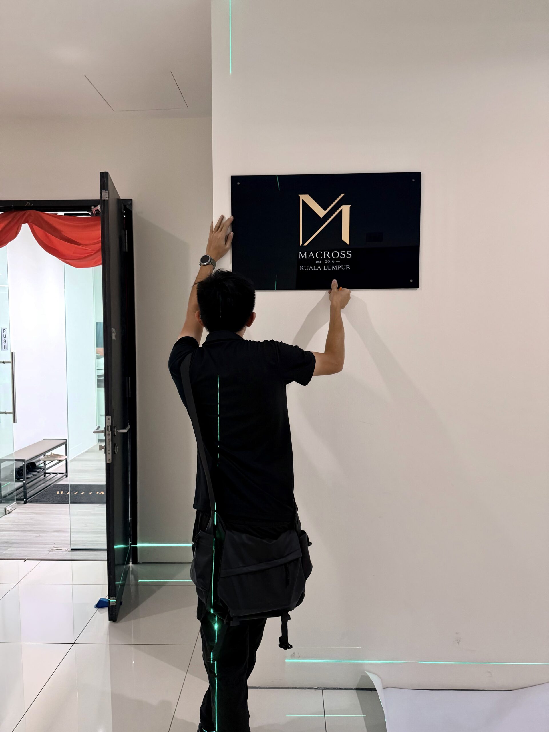
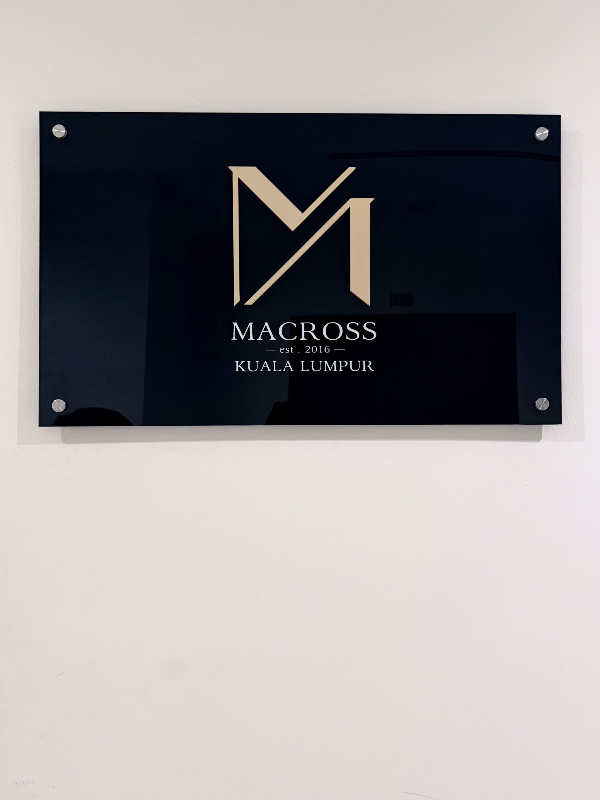
Following the management guidelines, the signage was produced using clear acrylic with a painted finish. The main logo was finished separately, while the white vinyl lettering was carefully applied onto the acrylic surface to complete the composition.
At first glance, the result may seem simple.
But simplicity leaves little room for error.
The proportion of the logo, positioning of the typography, vinyl alignment, edge finishing and even the overall visual balance after installation all contribute to how refined the final piece feels.
Good office signage is not simply there to decorate a wall.
It introduces the brand before the client even enters the office.
Clean · Corporate · Professional
Simple in appearance, considered in every detail.
 Shop Now