Not every wall in an office is meant to simply fill a space.
Some should tell you, at a glance, who the company is and what the brand feels like.
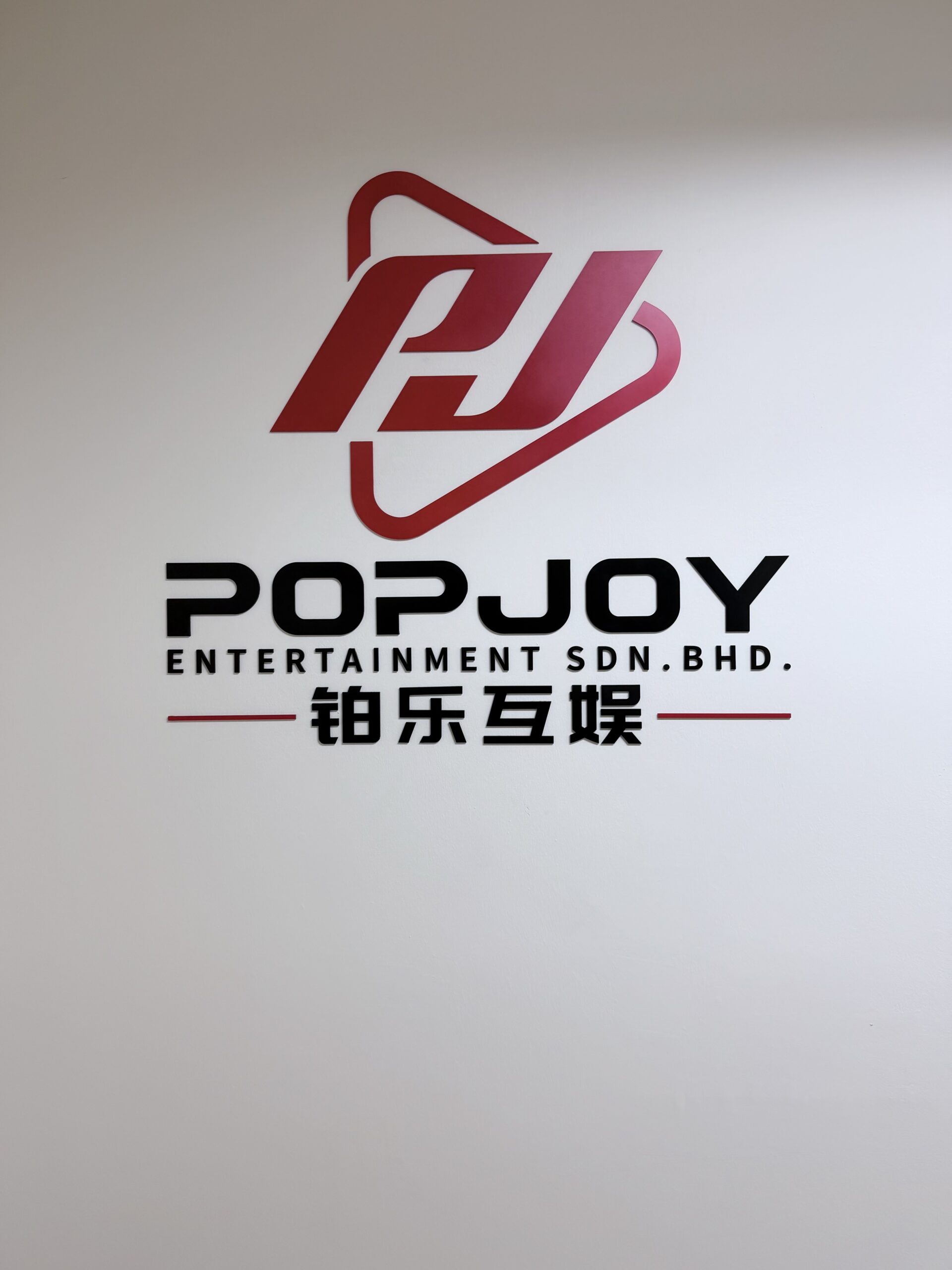
For this corporate feature wall, the identity was presented through a combination of the red and black painted logo, English company name and Chinese lettering.
The overall composition is simple, but highly recognisable.
When English and Chinese typography appear together, balance becomes especially important. The proportion, spacing and hierarchy between each element need to feel considered as one complete visual.
The logo should command attention.
The English lettering should retain the character of the brand.
And the Chinese text should never feel like information that was added afterwards.
It should belong to the design from the beginning.
There is no need for a complicated background or excessive decorative elements.
When the logo is produced accurately, the typography is arranged carefully and the proportions are right, even a plain white wall can become a strong expression of the company’s identity.
Simple, clear and unmistakably branded.
 Shop Now