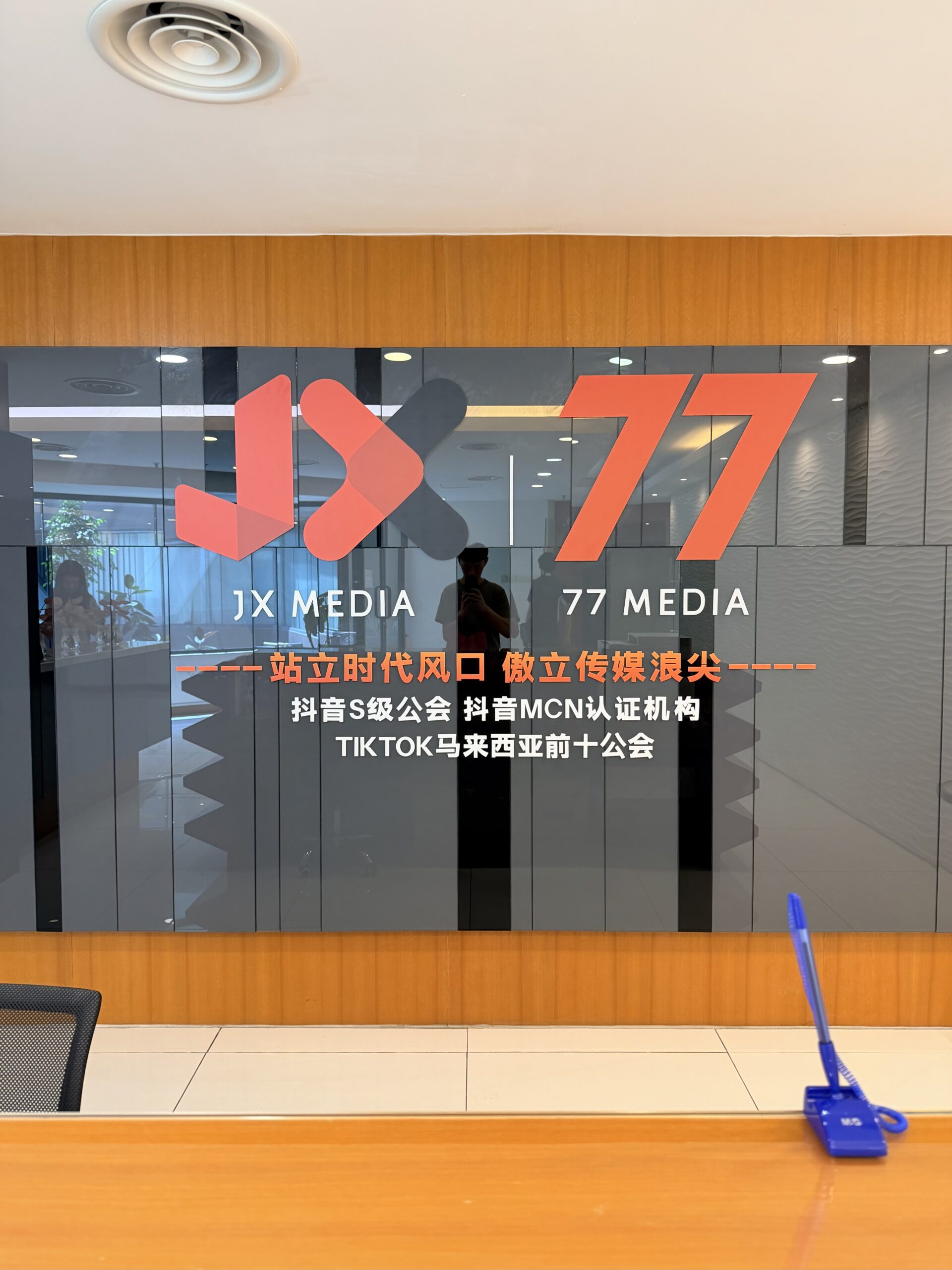
For this office glass wall design, the visual focus was not only on the logo and English lettering.
The Chinese text also played an important role in shaping the overall look of the space.
Depending on the brand’s visual style, we can pair different Chinese typefaces, font weights, sizes, colours and layouts so that the text does more than simply display information. It becomes part of the environment and contributes to the visual identity as a whole.
This becomes even more important when there is more Chinese content involved.
The hierarchy has to feel right.
The main heading needs to stand out. Key information should remain clear and easy to read. Supporting text, on the other hand, should complement the design without competing with the logo for attention.
What may appear to be just a few lines of text is often shaped by careful decisions behind the scenes.
Every size, spacing and placement affects the final result.
When done well, typography does not simply fill a surface. It helps define how the brand is seen within the space.
Quietly, clearly and with intention.
 Shop Now